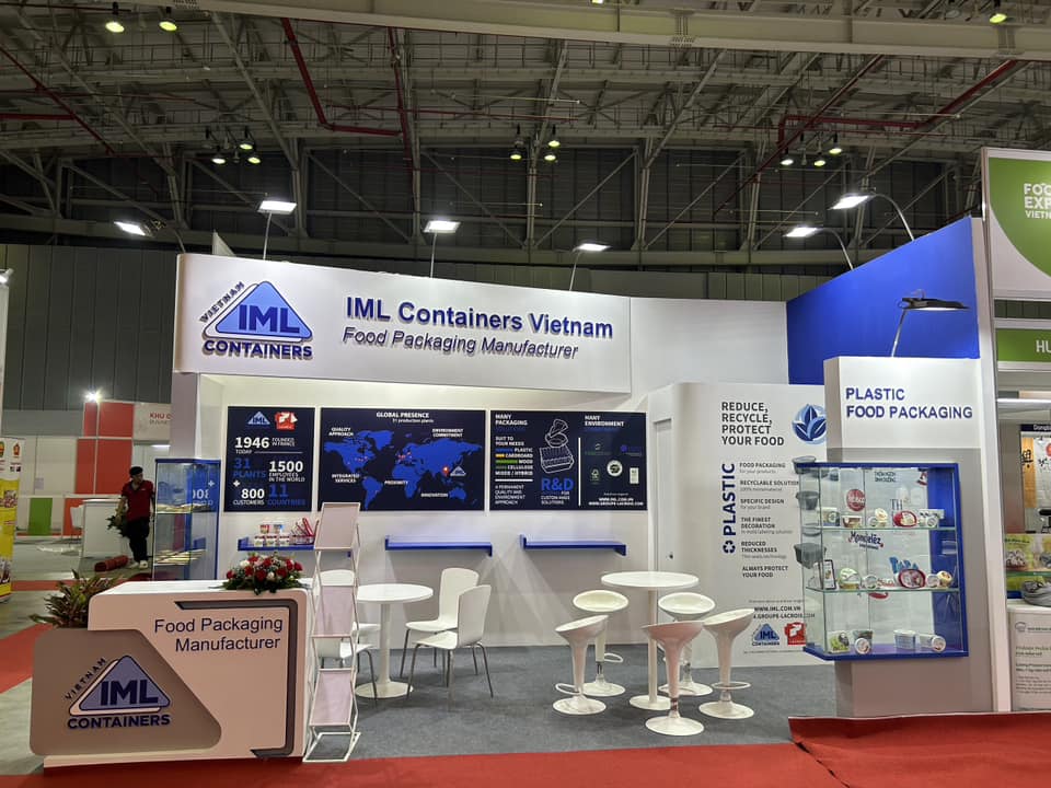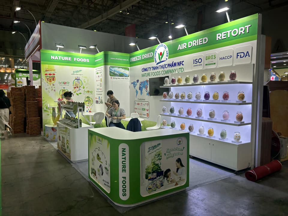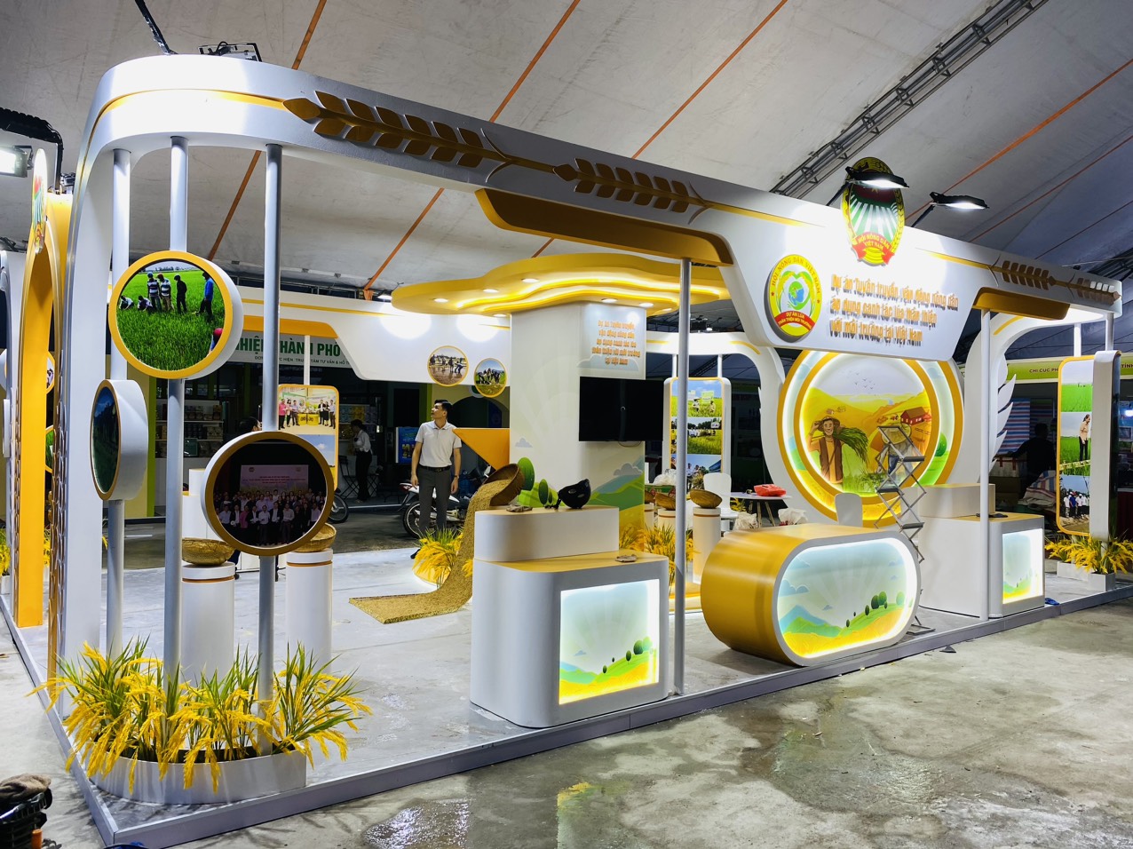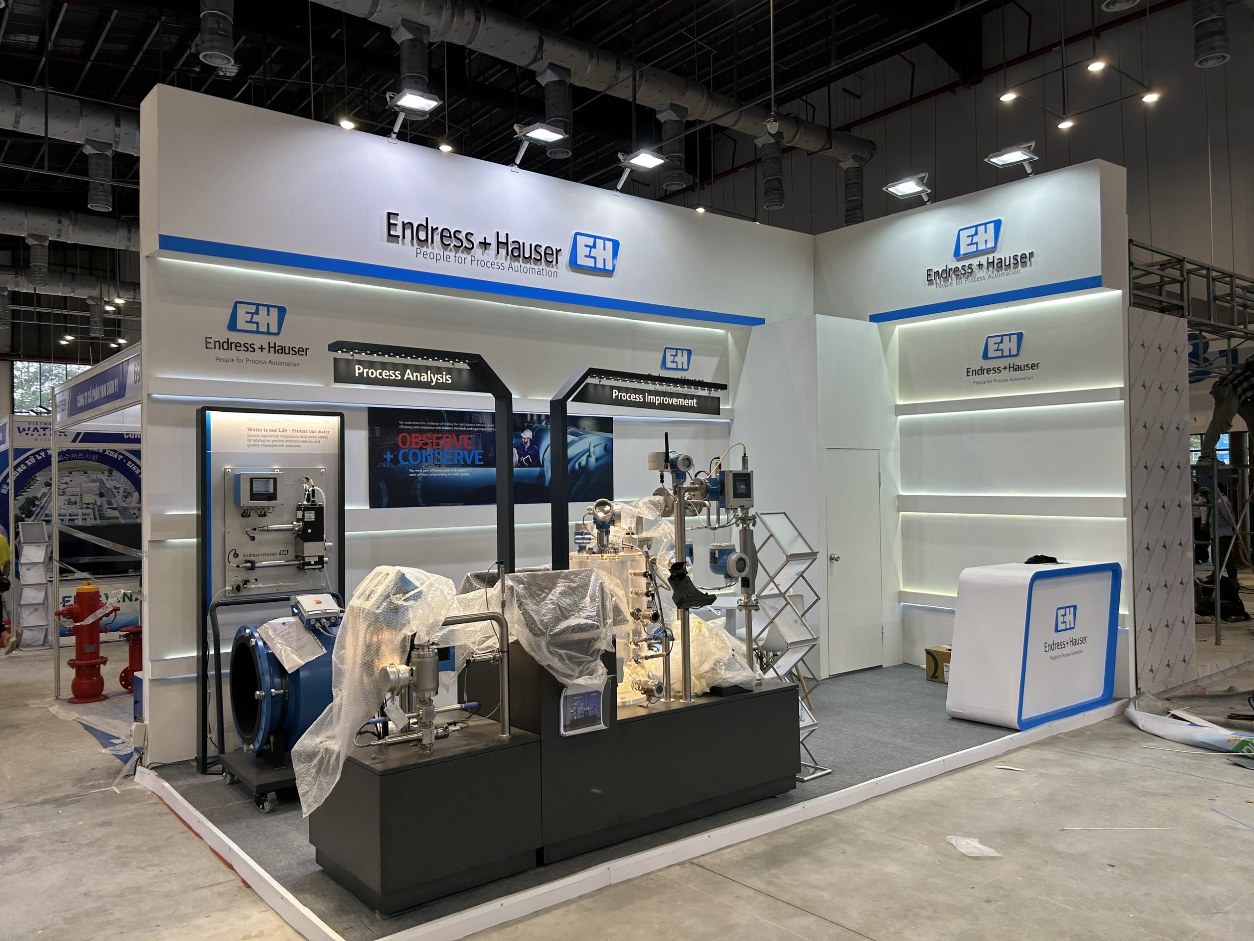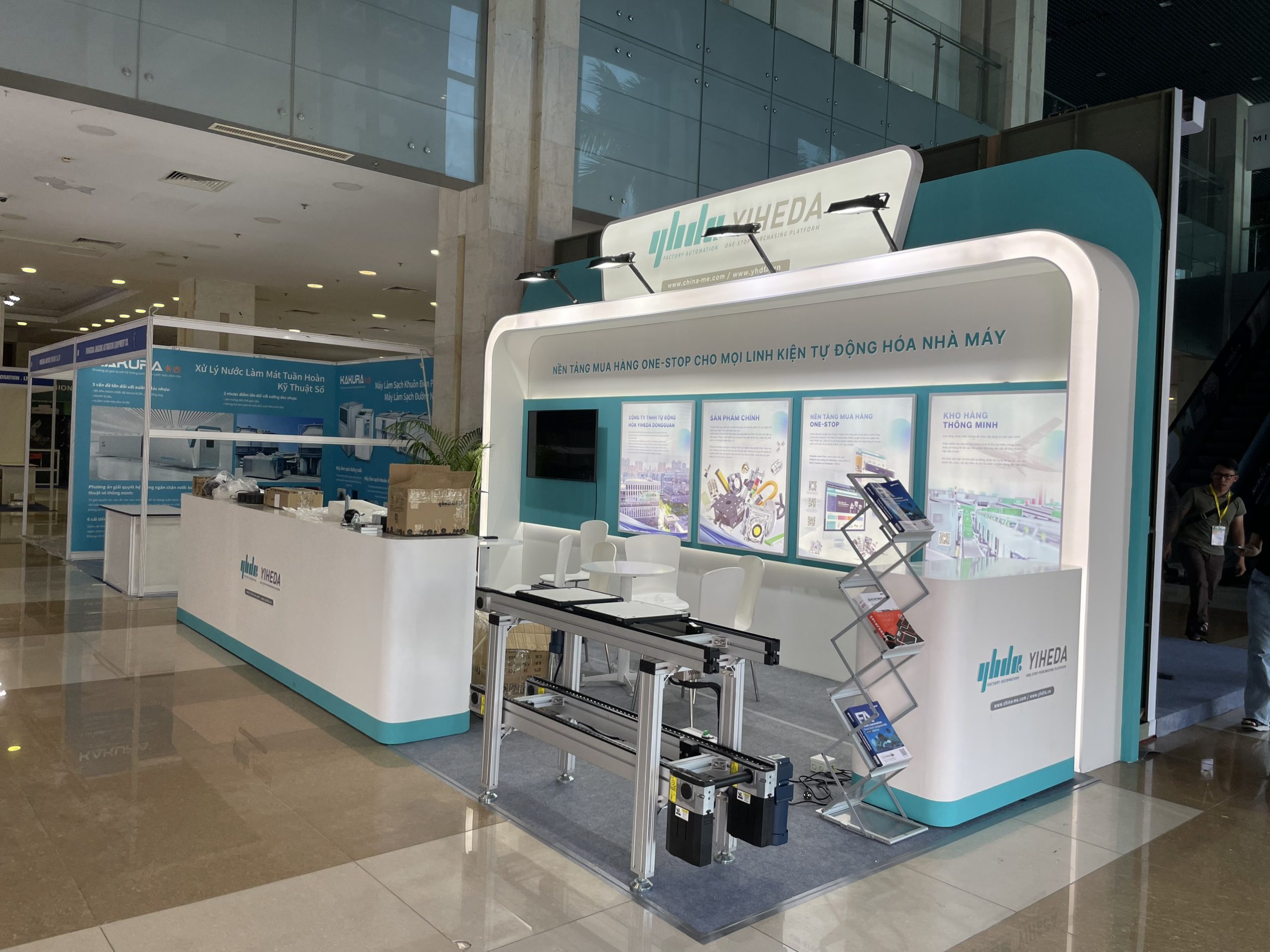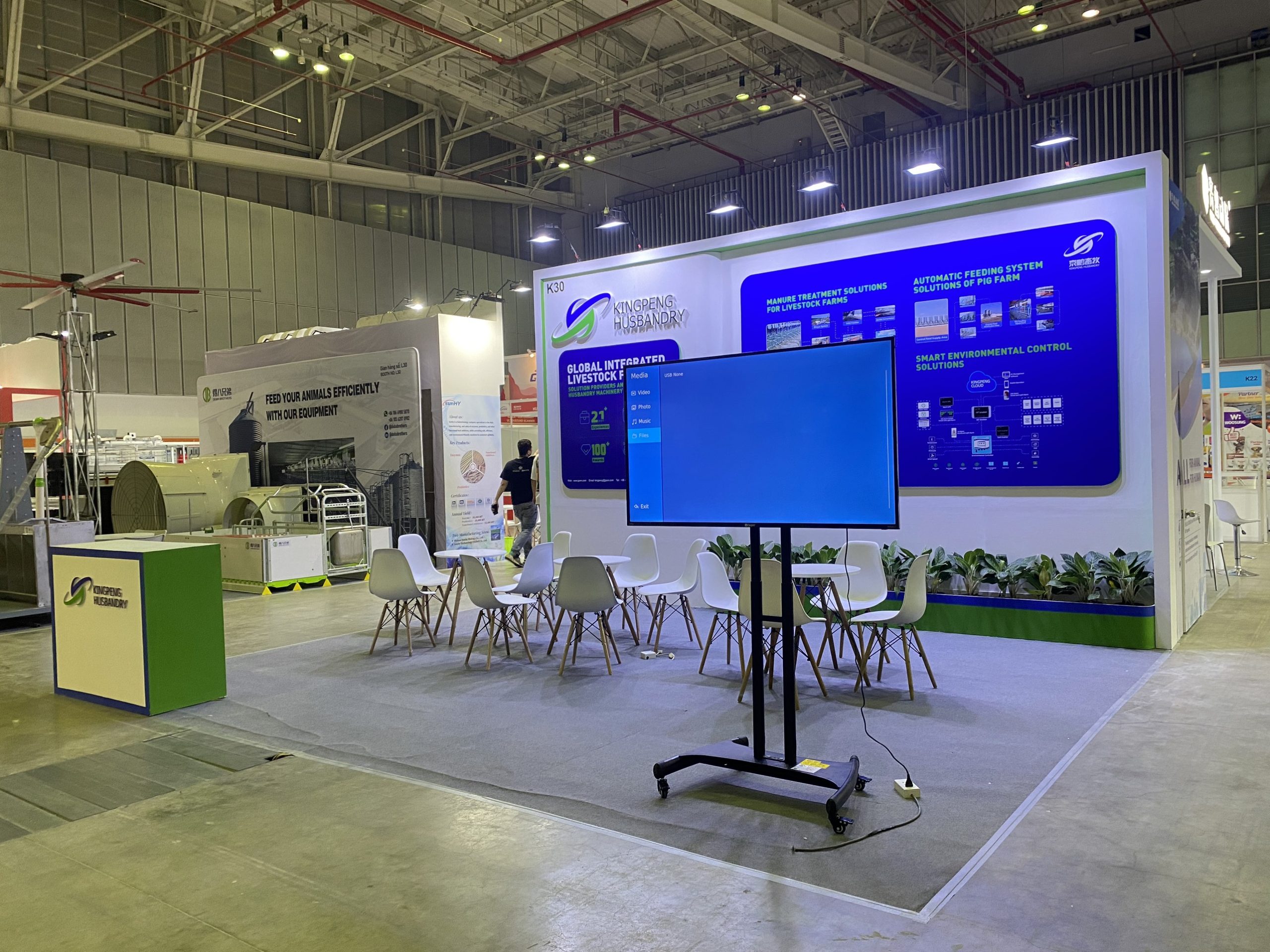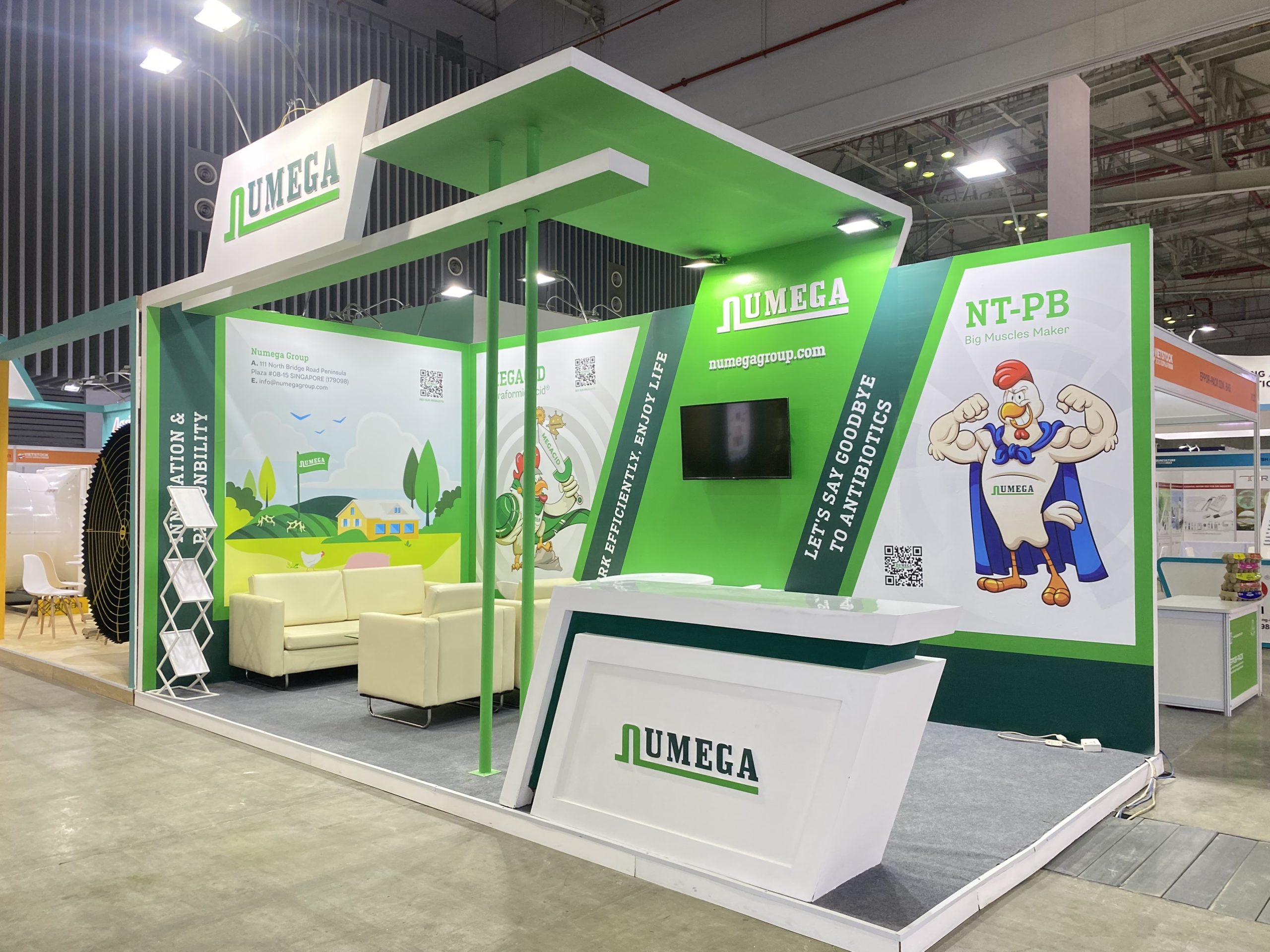
The wave of minimalism swept through every aspect of our lives in recent years, as the world became more chaotic. The exhibition booth design segment is not an exception. In this article, SDragon will explain why you should use minimalist booth design at MTA 2024, and suggest 5 techniques to captivate your visitors with minimalist exhibition design vietnam at MTA 2024.
MTA VIETNAM 2024 TIMELINE
MTV Vietnam 2024 – a major event for the mechanical engineering community in Southern Vietnam is scheduled from 2 – 5 July. The most advanced manufacturing equipment will be introduced at the exhibition by 450 companies, connecting foreign companies with the Vietnamese market and vice versa.
WHY SHOULD YOU USE MINIMALIST EXHIBITION DESIGN VIETNAM AT MTA 2024?
What is minimalist exhibition booth design?
The essence of minimalist booth design is the slogan “Less is more”, rooted from minimalism philosophy. It sounds cliche’, but reflects a very modern problem: the lack of meaning in our life. Have you ever felt tired of trying to control too many things in your life? How many of those are actually necessary? Minimalism tries to solve that problem by cutting irrelevant factors from your life and focusing on genuine values.
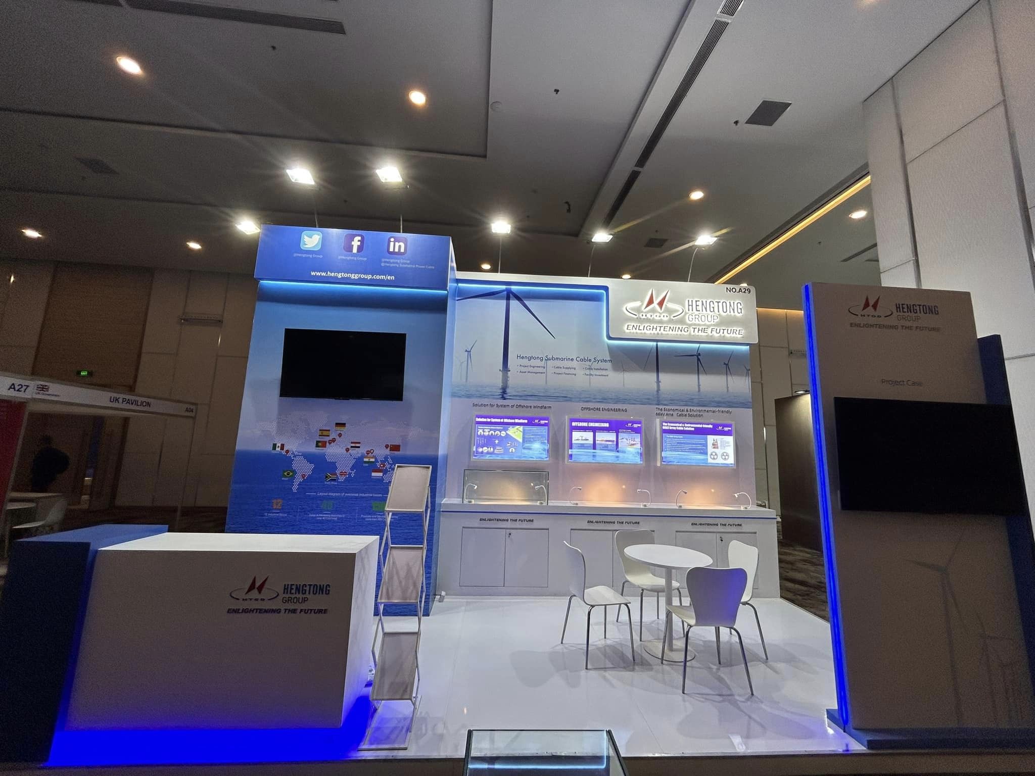
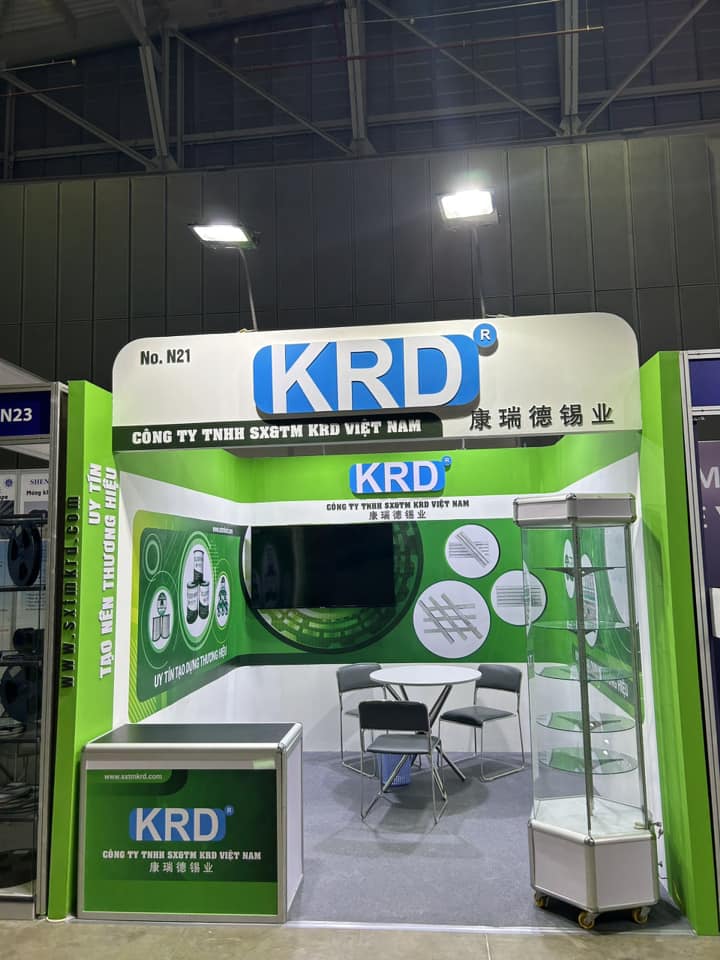
In that spirit, minimalist booth design aims to remove redundant details and forge a clear message for your booth. That means every element in your booth has to serve a specific purpose that complements the big idea. Due to its simplified nature, a minimalist booth design often comes with clear geometric shape, open space and limited color palettes.
Why should you use minimalist exhibition design vietnam at MTA 2024?
Not requiring too much resources, minimalist exhibition booth design can fit in any exhibition. However, it is extremely effective in MTA 2024 because of:
The compatibility with the nature of manufacturing machinery industry
What is your first thought about “manufacturing machines”? Precision, efficient, productive. Those are the same values that a minimalist booth design strives for. Therefore, minimalist exhibition booth design is the perfect approach to display your machinery at MTA 2024.
More spaces for gigantic machinery
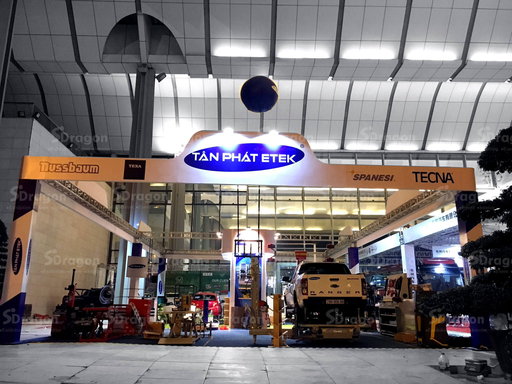
A manufacturing machinery does not consist of only the machinery itself, but also the support equipment like the power supply. As a result, it takes up a lot of space. A minimalist booth design will create the empty space that you need, as the open space is its main character.
The cost – saving feature
“Less is more” in this case means “Less unnecessary elements, more money saved”. As you have to carefully consider every component’s purpose in the minimalist design, you will realize that a lot of them can be cut. Individually, it may seem like you only save some pennies. But if you look at the total cost saved, you will be surprised.
5 TECHNIQUES TO CAPTIVATE YOUR VISITORS WITH MINIMALIST EXHIBITION DESIGN VIETNAM
Selective use of color palettes
The restricted use of color palettes is the core attribute of a minimalist booth design. A maximum of 3 color palettes is recommended, in which only one is the accent color. This accent color will highlight the main element of your exhibition booth. The other 2 colors are called base colors. The typical base colors are black and white. You can adjust the tone of these 2 colors to produce the desired result. For example, instead of using pure black color palettes, you can tone it down to gray. The final set of color palettes should be eye – catching while not too distracting.
Prioritize the geometric shape element
The ordinary geometric shapes such as squares, circles, triangles should be used as much as possible. Combined with the simple color code, it will create the most comprehensible exhibition booth design. In addition, with clear line shapes, you can divide the booth’s space more naturally. This will create better orientation for the visitors at your booth, allowing them to explore every sector with ease.
Use wall – mounted lights
The wall – mounted lights make the lighting display less visible to visitors, hence reducing the distraction. You should consider recessed lighting, as the light will be more subtle.
Choose simple typography
The typography should be easy to read so that visitors can understand your brand’s message. Therefore, you should choose simple typography that focuses on the clarity, not the decoration.
Get rid of unnecessary elements
Write down everything your booth may need on a sheet, then turn off the computer and do something else. After a few days, open the plan again and review it. The pause between the planning phase and review phase will allow you to have a fresh mindset to form objective assessments of the original plan. While determining the plan, you need to figure out which elements are futile in the overall design. Then, remove those unnecessary elements until everything in your booth expresses a clear and consistent message.
Construct your minimalist exhibition design vietnam at MTA 2024 with SDragon – experienced exhibition booth design unit
SDragon hopes that the article provided you with useful insights about the minimalist design and techniques to create the most impressive minimalist exhibition design vietnam at MTA 2024. If you need assistance in planning and constructing exhibition design vietnam, contact us via the information below.
You can look into our exhibition designs at MTA in these articles: Exhibition stand for Bodor at MTA HCM 2023 – Exhibition design Vietnam and Exhibition stand for HSG at MTA HCM 2023 – Exhibition design Vietnam
Contact information:
SDragon Vietnam Co., Ltd.
Address: Ba Dinh Building, No. 19 Le Thanh Nghi, Bach Mai Ward, Hai Ba Trung District, Hanoi | 283 Nguyen Thien Thuat, Ward 1, District 3, Ho Chi Minh City
Phone: (+84) 24 62888396 (HN) | (+84) 28 3930 6105 (HCM) | (+84) 97 505 9989 (Hotline)
Email: maianh@sdragon.com.vn
Website: www.sdragon.com.vn
